 Projects
Claude usage tool
The problem
An internal tool for the DNSK.WORK team, so the people paying for the models can see where the money goes.
Model spend is easy to start and hard to see. The people approving it were reading invoices; the people generating it were typing /status into Claude Code over and over to find out how close they were to a wall.
Both halves of that are the same failure. Usage is a live number that only ever arrived late, and in the wrong place, to the wrong person.
So: put consumption in front of the team who cause it, rather than the person who signs for it a month later.
What it had to show
Percentages and time, not tokens.
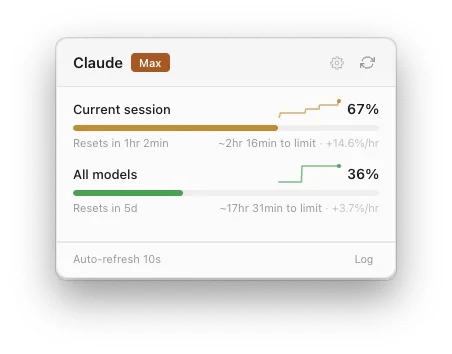
Nobody has a feel for what a token is worth, so the panel does not show any. It shows how much of the current session is gone, how much of the week, and when each resets.
The two numbers that actually change behaviour are the rate and the estimate: +14.6%/hr, and ~2hr 16min to limit. A percentage tells you where you are. Those two tell you whether to keep going, and that is the decision anyone is really making.
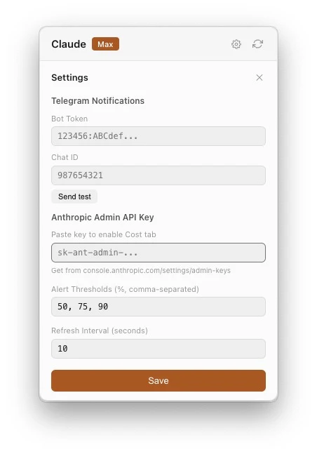
Behind the panel there is more – a thirty-minute sparkline per bar, separate limits for Sonnet and Opus, a thirty-day cost breakdown by model, and Telegram alerts at whatever thresholds you set. All of it deliberately behind the glance rather than in it.
Why it is this small
Menu bar only. No dock icon, no window to keep track of.
The whole thing is 452 pixels across, and that is a constraint I asked for rather than one I was given. A tool you check twenty times a day has to be readable in the second it takes to look at it, and anything that needs a second look would have been better as an email.
Two bars, two countdowns, two rates, and a refresh interval you can see. If a row would not survive being read in passing, it does not belong on the front.
DNSK.WORK built it, in Electron and React. The code is public and it installs with a Homebrew cask, which was not the original plan – it turned out that the problem was not specific to us.